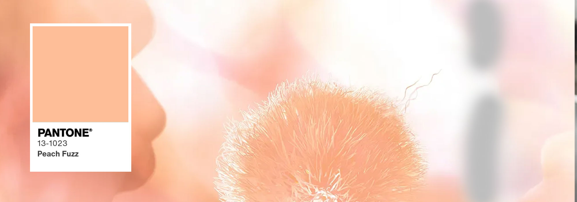


It’s finally here and the hugely anticipated Colour of the Year 2023 will be… Viva Magenta!

Source : Pantone Color Institute
A bold, fun and vibrant pinky purple that Leatrice Eiseman, Executive Director of the Pantone Color Institute, compared to “a fist in a velvet glove”. She also alluded to the hybrid aspect of Viva Magenta, which is the perfect “balance between warm and cool”. It’s a colour full of promise which, as in other years, will inspire brand after brand.
Since 2000, the Pantone Color Institute has selected the Pantone Colour of the Year, exerting major influence in the creative world of design, fashion and marketing.
At the end of the year, the Institute comes together to announce the result to the world: a unique and meaningful shade that is powerfully symbolic, reflecting society and trends.
You get the message: it’s much more than just a colour! But how is it chosen? What does it refer to? What impact does it have, especially in the textiles industry? How can you find it on TopTex among the many colours available? Read on to find out!
The Pantone Colour of the Year: how and why?
You’ve almost certainly heard of Pantone: founded in 1866, Pantone started out creating colour charts for the cosmetics industry. Then, in the 1990s, the Institute revolutionised the world of colour with the invention of Hexachrome: a six-colour printing process used to create and reproduce a huge palette of colours. Many more than with the CMYK colour model which uses just four: the famous Cyan, Magenta, Yellow and Black.
Pantone has since become THE colour benchmark in decoration, beauty, graphics, fashion… and much more.

Pantone shares this expertise with the world, revealing the colour for the year ahead every December. A committee of experts gathers to observe, analyse, debate, finalise and reveal the colour trend of the moment. Everything is scrutinised, from fashion week runways to film posters, social media, the world of art and street art, sport and even fashionable holiday destinations!
Finally, the Pantone Color Institute observes the current and anticipated popularity of a colour before confirming its choice. This choice is particularly influential as the colour is powerfully symbolic and much more than just a “trend”.
Viva Magenta: much more than a colour
The Colour of the Year reflects a general state of mind, a context, consumer expectations, and more. This makes it hugely inspirational for brands and their communications materials but not only for aesthetic reasons. “Before being a marketing gimmick, the Pantone Color of the Year allows you to take the pulse of the population,” says Marie-Chantal Milette, one of the world’s 100 colour experts. Not all brands have the same ability to renew their collections based on Pantone’s chosen colour. This is truer than ever in the current climate, given the criticism of over-production and over-consumption.
However, there is nothing preventing us from using hints of this colour and its variants for the occasional advertising campaign, goodies or customisable clothing and accessories to give them a modern touch!
TopTex offers:
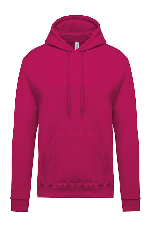
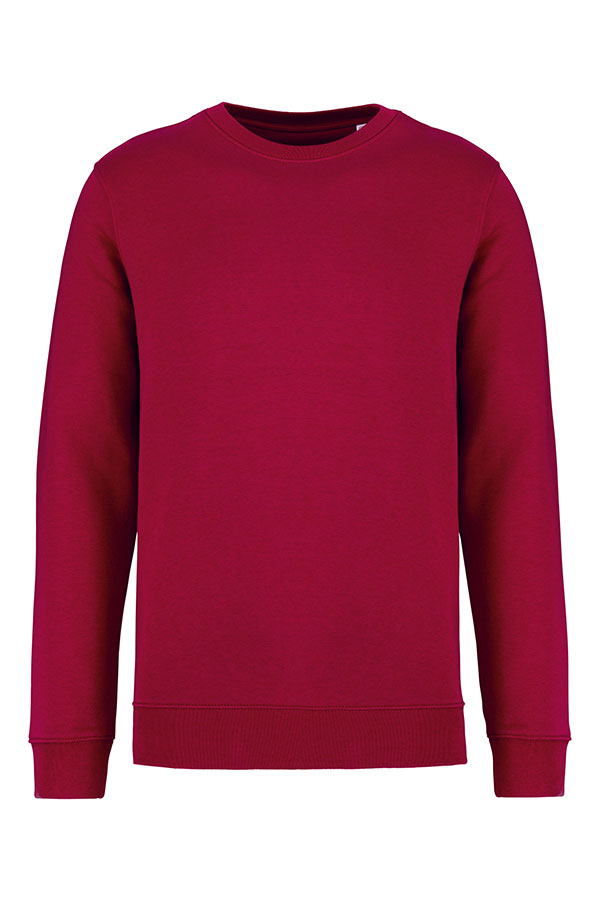
K476
Men’s hooded sweatshirt – Kariban
To inspire us further, the Pantone Color Institute has incorporated Viva Magenta into a wider colour palette they call the Magentaverse in a nod to the ever-expanding virtual world. This palette introduces us to a broad range of colour combination ideas. Paired with softer and more neutral shades, Viva Magenta is a bold pop of colour: a great way to offer your customers modern, striking and customised pieces!

Source : Pantone Color Institute
Magenta for customisable textiles? An emphatic YES!
There’s no ignoring Viva Magenta: this intense carmine is inspired by the red of the cochineal, a little insect that produces one of the world’s strongest and brightest natural dyes, as described by the Pantone Color Institute.
Its vibrant and sparkling appearance makes it particularly visible and perfect for high-impact advertising textiles and accessories.
Application ideas:
- During a sports event, fuchsia caps are visible even in unpredictable weather
- For a more subtle effect, PANTONE 18-1750 Viva Magenta embroidery will create a striking message on a neutral sweatshirt
- In a small store building its brand, a sparkling capsule collection is sure to win over new customers!
- Not to mention accessories: a scarf, socks or a sports bag in bright pinky red can bring a fun and vibrant touch to any outfit!
Endless options for your customers to send a clear message in their communications campaigns or to their teams. This is evidenced by the symbolism of Viva Magenta, a pinky red that is playful and bold as well as confident and gentle.
This distinctly modern and positive colour will pair perfectly with the more neutral and discreet shades you’re sure to find in the TopTex product selection.
The TopTex selection based on the Magentaverse colour palette
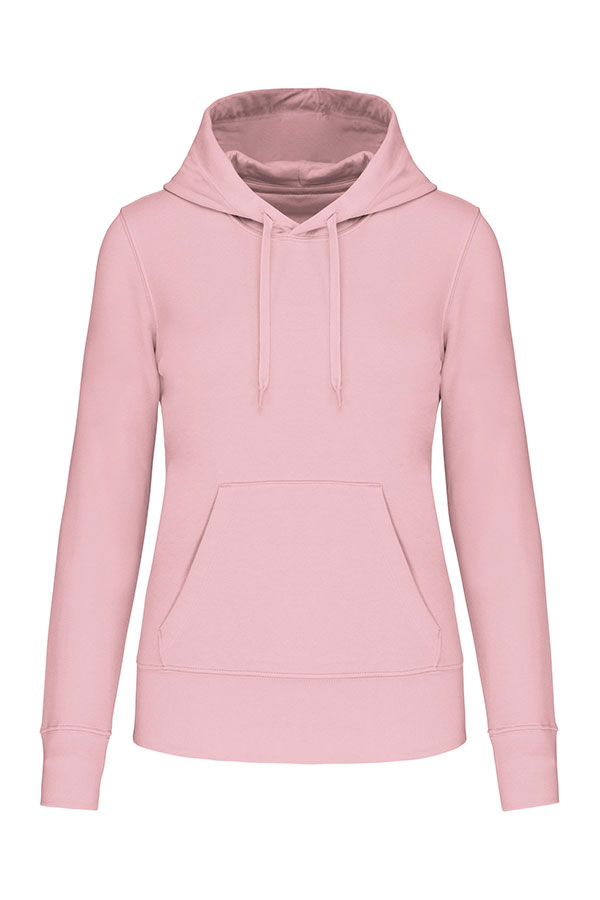
K4028
Ladies’ eco-friendly hooded sweatshirt – Kariban
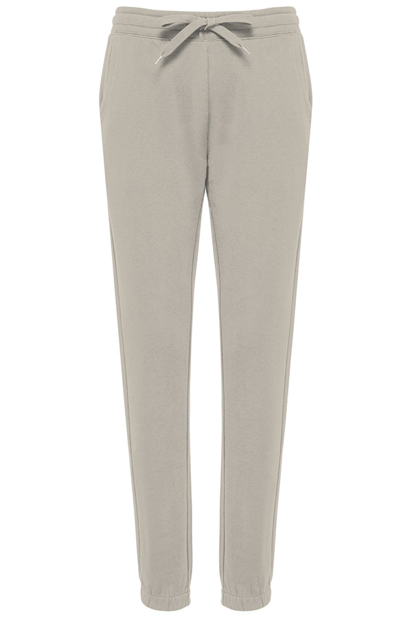
K7027
Ladies’ eco-friendly fleece trousers – Kariban
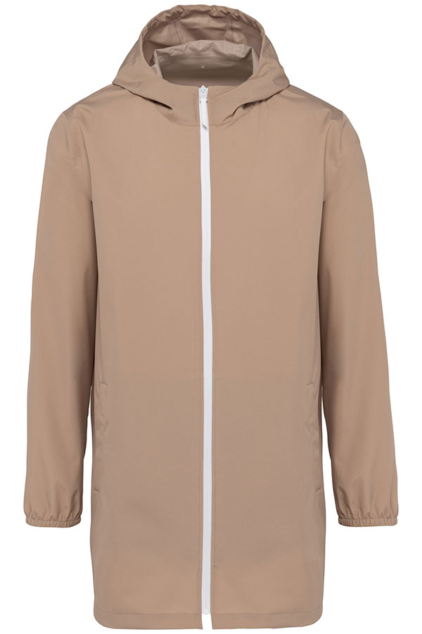
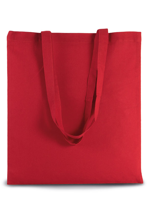
KI0223
Basic shopper bag – Kimood
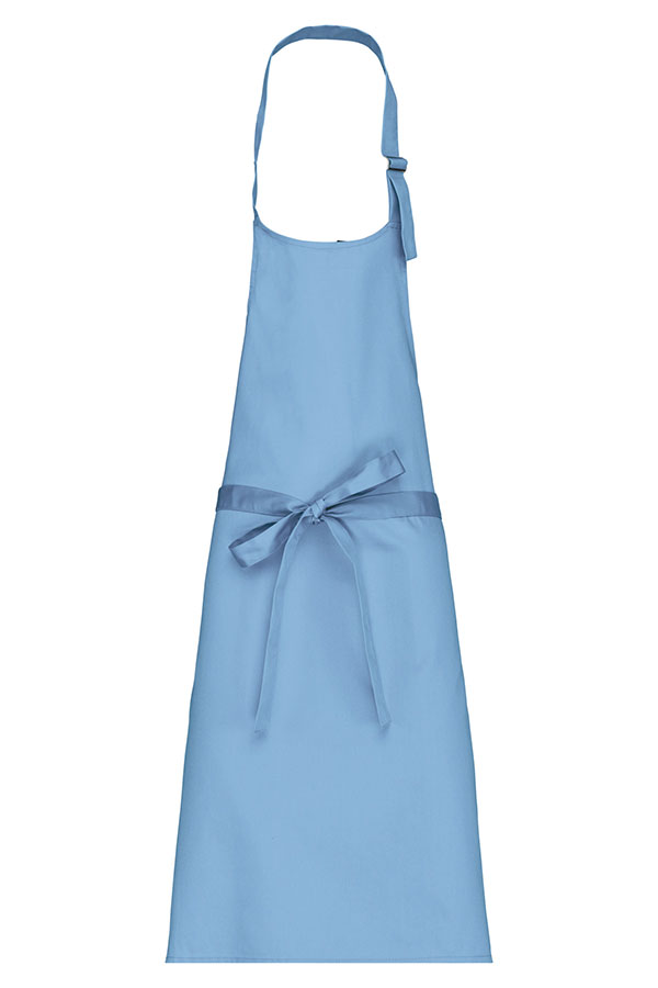
K8000
Polycotton apron without pocket – Kariban
You now know how the Colour of the Year is chosen and how to include it in the offerings you make to your customers. Pantone is clear that this is just an observation and suggestion which may inspire communications campaigns. Each brand can either choose to integrate the colour into a visual or customised goodies or decide that it’s not coherent with their positioning and graphic charter.
So there’s no obligation! But, this year, the liveliness of Pantone’s Magenta is a reminder that a dash of colour is an excellent way to ensure visibility and “break outside of the box”, in the customisable textile industry too.
To find the shades, use the colour filters to select products available in an extensive palette. The TopTex teams are on-hand to offer support and suggest colour combinations!